I’m trying to make some new logos and typography! One problem I’m running into is the fact that my website background currently isn’t white, but for some reason WordPress is obsessed with making sure the transparent images gain a white background, so it’s creating something very clumsy and slapdash.
I’m fighting something bizarre. But here’s what I’ve got so far!

Here are some little molten records; I’m not sure what color combination I want to go with, and considering the off-white background might be biting me in a few ways, I don’t know if I even will. But they’re fun anyhow!

This was a version of the logo I considered, though I think it’s a bit heavy-metal looking, which isn’t the sort of scribbled-out, chunky vibe I want for the blog. I think this one looks a little too scary! Whoopsie.
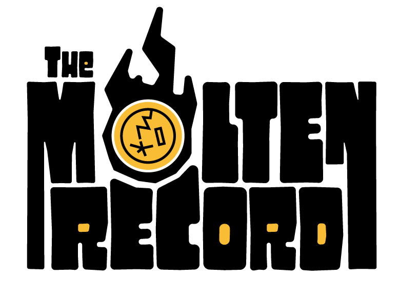
I also am considering this one! It’s still a little bit angrier-looking than I think I want, but it’s still a fun idea! I also noticed that the left leg of the N isn’t the same height as the others now. Yeesh.
I think in the end I want something that looks sort of retro and kitschy, which could be cool. Slow going, as all good graphic design ends up being.
Leave a Reply